


iWhite DLX $110.00 - [ view ]
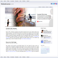

 Name: iWhite DLX
Price: $110.00
Type: Mobile Responsive
18 Pages: Home, about, contact page with form, site map, links, downloads page, payment page with Paypal, 4 article pages, 4 slideshows and slideshow index, missing and thanks pages.
Features: Multi-field contact form, jQuery slideshows. AdSense ready, view AdSense sample. Configured for all web browsers and computer and device types.
Details: HTML5 / CSS, JPG images, meta tags included for optimal viewing on all mobile devices. (Details) Human and business stock photos.

Name: iWhite DLXPrice: $110.00
Type: Mobile Responsive
18 Pages: Home, about, contact page with form, site map, links, downloads page, payment page with Paypal, 4 article pages, 4 slideshows and slideshow index, missing and thanks pages.
Features: Multi-field contact form, jQuery slideshows. AdSense ready, view AdSense sample. Configured for all web browsers and computer and device types.
Details: HTML5 / CSS, JPG images, meta tags included for optimal viewing on all mobile devices. (Details) Human and business stock photos.
Updated: 2025
Click for view on iPad
Contact us about this site
Responsive Business Templates
Configured for optimal tablet, smartphone and desktop / laptop viewing, these designs can be used for any personal or business website project. Duplicate any page to add new pages. Edit with any HTML or plain text editor. Notepad, TextEdit, Exp Web, Frontpage, Dreamweaver, etc.
|
iFlower DLX $110.00 - [ view ]
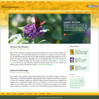
Name: iFlower DLX
Price: $110.00
Type: Mobile Responsive
18 Pages: Home, about, contact page with form, site map, links, downloads page, payment page with Paypal, 4 article pages, 4 slideshows and slideshow index, missing and thanks pages.
Features: Multi-field contact form, jQuery slideshows. AdSense ready, view AdSense sample. Configured for all web browsers and computer and device types.
Details: HTML5 / CSS, JPG images, meta tags included for optimal viewing on all mobile devices. (Details) Nature and flower stock photos.
Name: iFlower DLXPrice: $110.00
Type: Mobile Responsive
18 Pages: Home, about, contact page with form, site map, links, downloads page, payment page with Paypal, 4 article pages, 4 slideshows and slideshow index, missing and thanks pages.
Features: Multi-field contact form, jQuery slideshows. AdSense ready, view AdSense sample. Configured for all web browsers and computer and device types.
Details: HTML5 / CSS, JPG images, meta tags included for optimal viewing on all mobile devices. (Details) Nature and flower stock photos.
Updated: 2025
Click for view on iPad
Contact us about this site
Responsive Web Template Details
No monthly fees / Built in basic HTML & CSS to W3C standards, Allwebco Design responsive website templates are complete sites configured for viewing on all devices for any screen resolution using media queries css code. Pages flex for PC and Mac computers, laptops, tablets, smartphones and all other mobile devices. Built with multiple pre-formatted pages, a global css style file, plain text headers and footers, web standards contact form, and global plain text editable menus for easy website expansion and updates. Any page can be duplicated and/or renamed to customize the design to your specifications. Buttons can be added and removed in the global "menu.js" using any plain text editor. For both novice web designers and professional developers on PC or Mac. See also what are website templates?. Works with any web hosting company.Developer Grade
Downloads include all stock photos, source files and code used for the build. Plain text global menus, headers and footers. Standard .jpg images. All fonts, colors and layout sizes and elements are edited in the CSS style file. See more on color editing. Media Queries css code is used to allow webpages to respond to any viewing device screen resolution. Meta and heading tags, image alt, and html codes are built-in to allow for optimal SEO (search engine optimization). You can simply plug-in your meta and alt data allowing for optimal placement in all search engines. View more on optimization.Support
Downloads include step by step instructions and developer staffed email support. Includes our 30 day no-questions asked 100% money back guarantee. We also offer a 90 day exchange guarantee with full credit from the original purchase. Upgrades for any template model are free for the life of the design and a new download may be requested free of charge. Free scripts and addons are available in the searchable web template support area.Allwebco responsive web design (RWD) website templates are sold exclusively on the Allwebco Design Corporation website. Designs are not available anywhere else.